CI
로고마크는 ‘행복 날개’의 조형적 특성을 고려하여 개발된 것입니다.
로고 마크만 단독으로 사용하는 것이 적용 공간에 따른 제약이 적고 가독성을 높여주는 장점이 있으나,
SK를 대표하는 Identifier로 사용하기에는 상징성이 부족하다는 단점이 있습니다. 따라서 매체
표현 시 로고마크는 효과적인 SK Identifier의 전달을 위해 ‘행복 날개’ 심벌마크와 결합하여
사용하는 것을 원칙으로 합니다.
로고마크는 Bliss Bold 서체를 기본으로 디자인하여 완성되었습니다. Bliss Bold 서체는 곡선이 많은 부드러운 서체로 형태가 단순하고 읽기 쉽습니다.
S와 K의 끝을 곡선으로 부드럽게 처리하여 글자 사이의 공간감을 느낄 수 있도록 하였습니다. 이러한 조형적 특징을 통해 부드럽고 친근한 이미지를 전달합니다.
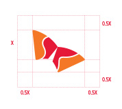
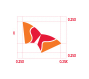
‘행복 날개’는 SK Identifier의 조형적 특징 및 상징성을 가장 잘 드러내는 요소이며 아이덴티티의 왜곡, 변형 및 오남용 등에 따른 이미지 손상 방지를 위하여 심벌마크 적용에 따른 규정과 원칙을 반드시 준수해야 합니다. ‘행복 날개’는 통신위성, 연 등을 모티브로 비상하는 두 날개를 형상화하여, SK의 양대 성장 축인 에너지화학과 정보통신 산업의 약진을 상징하고 글로벌 시장을 향한 진취적 기상과 ‘행복 추구’의지를 구현한 SK의 얼굴입니다.
비상(飛上)의 의미와 함께 역동적이고 진취적인 느낌을 표현하고 있습니다. Identifier에서 심벌마크의 사용은 왼쪽에 규정된 각도(29.4˚)를 준수해야 합니다.
'행복 날개'의 흰색 라인은 SK의 S와 K를 표현하고 있습니다. 이는 SK의 Identifier 강화를 위한 부분이므로, 어긋나거나 왜곡되어서는 안 됩니다.
-
SK인천석유화학